

Hey everyone.]
So update 98/99 has gone live which fixes the crashes (thanks for the reports).
I’m gearing up for a pretty sizable release but just wanted to check in and ask if there was any issues you’re having that I should know about or any new feature requests.
Sorry for the bad comms but I’m making my way through lots of messages and posts on here. Thanks for the patience as I get through these all.
Cheers, Lj
You must log in or register to comment.
Hello, I’m a slut and I’d like to be able to upload NSFW pictures again ❣️
I’ll get that enabled again 🫡
Any option about block NSFW content during hours (work) instead of having to toggle on/off?
Umm… Redgifs stopped working
Dad please turn the porn back on
Fix is going live. I completely rewrote this part and should be able to fix it remotely in future without deploying a new apk.
I’m partly colorblind and it’s super hard for me to see when I upvoted or downvoted a post. Just making the up or down arrow bolder (or circled) once it’s been clicked would fix the issue completely for me and all types of colorblind people.
Thank you for the great work 💛
deleted by creator
It’s blue, you plonker
deleted by creator
Yellow is very visible, it was intentional but with no specific purpose :) There are multiple types of color blindness but all of them will be aggravated if a font or shape is thin or just outlined (which is not the case with a filled in heart emoji)
Yellow is actually quite normally visible for most colorblind people. Blue is as well, interestingly.
The most typical type of colorblindness involves inability to distinguish between red and green.
Is there a particular significance of a yellow one?
Edit: oh dammit I just got it.
Added support for the next release to change the colors.
Which view type are you using?
I’m not sure where to find which one I’m using. I use dark mode and the colors I’m having trouble with if the font is too thin or small are the orange and light blue. Changing the font weight or adding another style would also mean this is visible in night mode on Android (which removes all colors)
Edit : I investigated the viewtypes and they all have the same issue of using the same font size and weight, just using the orange/blue color for the number of upvotes and the selected arrow.
Edit 2 : increasing brightness helps a lot with the colors, but I’m mostly using Sync at night on minimum brightness.
The best way for you to visualize the issue would be to activate black and white night mode on Android :)
Thanks for the update.
Would allowing setting a custom color help?
Not sure how I would use that. Do you mean 2 custom colors to change both the default orange and blue? I can perfectly distinguish them when they’re on a bolder shape (🟠🔵), it’s just a lot harder (or sometimes impossible) on a thin line/symbol.
Again, the most efficient way to handle it would be to have a different style for the selected arrow (bolder, bigger, underlined or circled for example), on top of its color. It would then work as well in bedtime mode (b/w and low brightness) for everyone, not just for color blind people :)
I think bedtime mode activates by default on newer Android devices after 10pm when the phone is charging. That’s how mine (OnePlus) was set up.
I see my initial reply was upvoted about 30 times. Statistically speaking, I don’t think these would be only from color blind people
The biggest thing I’d wish for is full markdown support, stuff like spoiler tags, superscript and tables is still not working properly and it would be nice if it did.
I also don’t know if this is a bug others experience or if I have messed something up on my device, but clicking community links sometimes opens up the link in browser instead of in Sync.
Finally, highlighting new comments on a thread re-visit would be a dream, but last I heard it wasn’t supported by the backend. But maybe an option to highlight comments made during the last X minutes as a sort of hack?
Noted, I think its probably time to completely replace the old markdown processor.
As for tables, how are they not working right?
Do you have an example of a link that opens the browser?
I think there were issues if tables got too wide IIRC. Tables are a bit of a nightmare to deal with though. I would also personally prefer to not hide the borders for better readability, but I guess that’s more of a preference and less of an issue.
For links, I have not been able to deduce a pattern. I usually test with the posts at !trendingcommunities@feddit.nl For a while I thought it was related to certain instances, but in today’s post one of the links going to lemmy.ca opened in browser and another in Sync. Very puzzling.
Nothing to report or add, I just appreciate you!
(シ_ _)シ
Thank you for making this app 💜💜💜
Is there a way to make “deleted by user” stand out more as a system message? The current styling makes it look like they literally commented “deleted by user”
I have a feature request. Harmonic for hackernews has the option to open a url directly on archive.org, which I think is a pretty neat feature. Would it be possible to add this?
How would that work exactly?
Like this link https://google.com would open https://archive.org/details/google.com ?
You can use the wayback machine api to retrieve the latest snapshot of a particular url, which is useful to evade paywalls.
Perfect. I’ll add support.
I just tested with a random link and it’s exactly that.
I’m hoping the new update will include the new “scaled” sorting option. I think it will really help support smaller communities on Lemmy if more people use it.
Changing default sort to hot does not stick for me.
Redgifs is broken (as is tradition) ¯\_(ツ)_/¯
Device information
Sync version: v23.11.29-22:27 Sync flavor: googlePlay Ultra user: false View type: Slides Push enabled: false Device: bluejay Model: Google Pixel 6a Android: 14Fix for redgifs is going live now.
Yay, we’ll have redgifs accessible for 48 hours! After which I fully expect them to break it again
What will you do for the other 47 hours and 57 minutes?
I’m old, don’t shame my refractory period
Settings > Account settings > post sort?
You’re not gonna believe this man, but you can actually directly link to the setting ;)
How?
By long pressing the option the link gets copied to your clipboard.
Sweet. That’s really good to know
deleted by creator
I can set it there but visiting my instance or my subscribed it still always sort by active instead of what I have set
Edit: I just notice that there is a save button . It works, when I save 😉
Did you change it here?
Settings > Account settings
Yeah, my problem was in just overlooking the save button at the top right of that page. Maybe a reminder if you leave without saving would help or make it autosave when a setting is changed.
I’ll add another feature request that I forgot: instance browsing. Being able to see a list of communities within a remote instance would be nice (preferably sorted by subscribers like in the web UI). Being able to see the Local feed from a selected remote instance would also be useful. I think both those features could help with community discovery.
EDIT: disregard most of this, I was blind to the instances button. It would still be nice to see the communities-list on an instance sorted by size.
Is that different than using the “instance” button to go to (for example) lemmy.world and then the “communities” button to bring up this list:
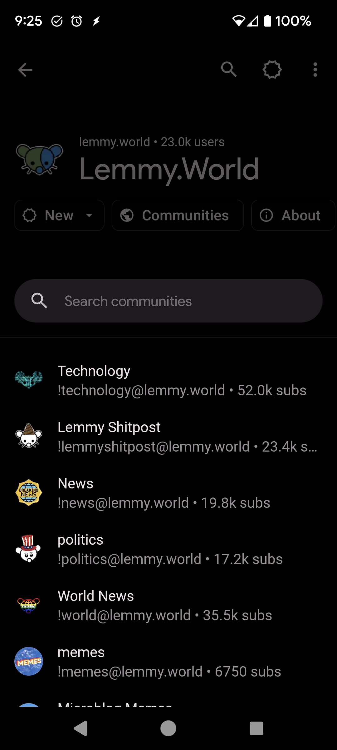
(Edit: I see that my pic isn’t all sorted by size, and that’s a difference, but I’m genuinely curious about other ways to browse other instances since I’m basically alone on mine)
EDIT: I was apparently blind to the instances button dear lord.
Being able to see communities on an instance sorted by size like the web UI would be nice, though, still.
That’s fair 😁
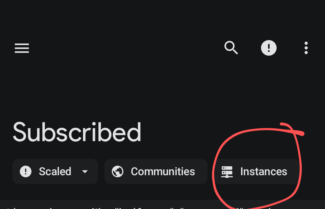
So where is this instances button?!
Right on top of your feed.
Thx
Find it? (New comments aren’t highlited yet, so I didn’t notice this)
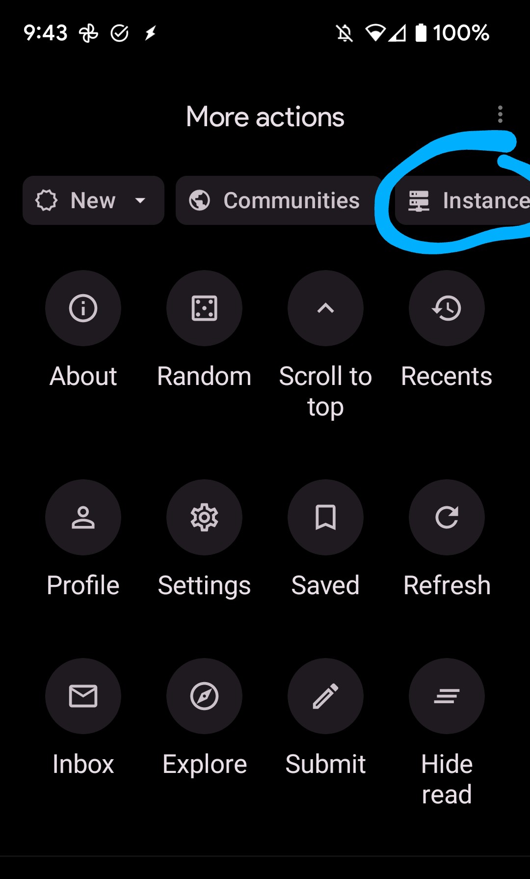
There’s also one in my More Actions menu (the 3 dots in the upper right)
Thx
Good to see you’re still alive! Looking forward to future updates and improvements.
I’d love the ability to block entire instances from within the app, or hide if that API isn’t available.
Is it different from the instance filter here: Settings shortcut: Filters > Instance filters ? (I see that I have accounts blocked and communities blocked, but I haven’t tried blocking or filtering any instances)
Ah! I spent ages looking from the Instance page but didn’t think to look in there. That’ll do!
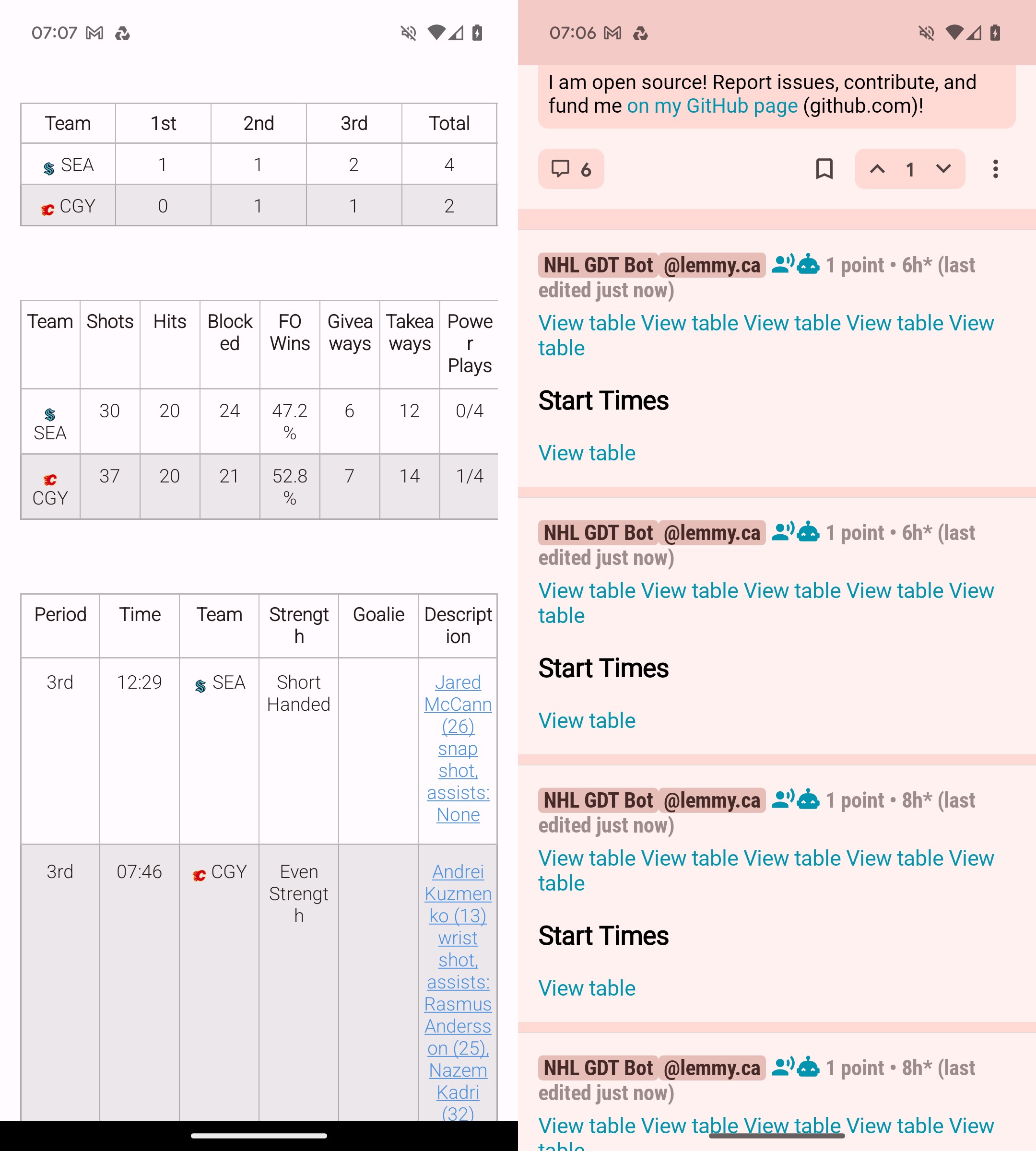
Using Boost for Lemmy as the example here.
Since release Sync just hasn’t been able to handle tables. Every other app I use does it no problem, but sync really struggles with it.

Another example, although less painful for the eyes.
Well in this example, I’d say it’s just differently formatted. The borders are not visible and Text isn’t centered.
In the example before, I feel like it is that Sync hides the table when it is too wide/or the multiple tables are tried to be placed side by side instead of below each other? I’d also prefer the left side, probably 👍 But tables are a nightmare these days with dynamic layouts.
Can you link the post? What to see to see how it works on my other lemmy apps.
https://lemmy.ca/post/16714260
I think that’ll work. Still not entirely sure on how Lemmy handles links.
Just chiming in to say thanks for the update and all the hard work!