You must log in or register to comment.
This is known as optical alignment. It’s very common in font design.
That’s neat. And pointy letters even moreso.
FQOT
That title doesn’t seem true. I zoomed in on the text above and took a screenshot, then zoomed in even more on that screenshot and edited in some marker lines:
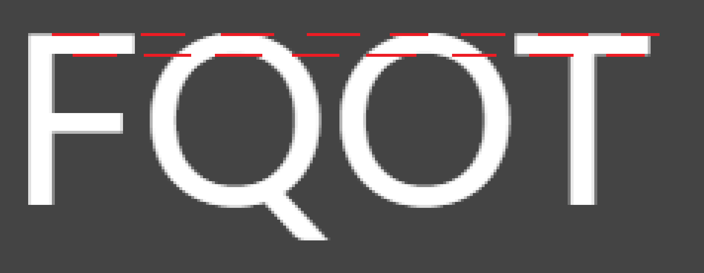
Maybe some fonts do that, but not the default one used on Lemmy. Nor, I suspect, most common web sans serif fonts.
The smaller the font the less noticable, especially with pixelation. But look at the top red line you drew, the F & T are grey pixels and the Q & O are white in the center.
The anti-aliasing there indicates the O and Q are the full pixel in height and the F, T are a half pixel in height.
how it looks on my Android phone on Firefox