willya@lemmyf.uk to memes@lemmy.worldEnglish · 6 months agoIcon designlemmyf.ukimagemessage-square80fedilinkarrow-up1471arrow-down145
arrow-up1426arrow-down1imageIcon designlemmyf.ukwillya@lemmyf.uk to memes@lemmy.worldEnglish · 6 months agomessage-square80fedilink
minus-squareImpossibilityBox@lemmy.worldlinkfedilinkarrow-up59arrow-down2·6 months agoCounterpoint is the bullshit Google did with all their icons. Same exact colors with different shapes makes quick differentiation an actual challenge.
minus-square0ops@lemm.eelinkfedilinkarrow-up11·6 months agoThat’s gotta be an icon pack, given the black and the weird colors. Am I wrong? Did they change it since I last used the stock icons?
minus-squareImpossibilityBox@lemmy.worldlinkfedilinkarrow-up10·6 months agoI forgot I had an icon pack on. Original is actually worse. No large silhouettes to work with.
minus-square0ops@lemm.eelinkfedilinkarrow-up4·6 months agoNot disagreeing with you there. I wasn’t even much of an icon pack guy until they did the white circle thing. It looks so cheap
minus-squarepurplemonkeymad@programming.devlinkfedilinkarrow-up7·6 months agoAnd then they introduced to android a new option that only showed the shape of the icon in two tones. Now they have no colour and are just odd shapes.
minus-squareBlanK0@lemmy.mllinkfedilinkarrow-up3·6 months agoAlthough the icons are kinda not minimal with the amount of colors in there, they could have like made one app with one or two colors and the other with different ones
minus-squarepoppy@lemm.eelinkfedilinkarrow-up2·6 months agoWhy does Drive not match the color tone of the rest of them? It’s so muted.


Counterpoint is the bullshit Google did with all their icons. Same exact colors with different shapes makes quick differentiation an actual challenge.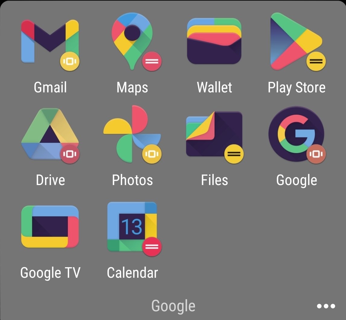
That’s gotta be an icon pack, given the black and the weird colors. Am I wrong? Did they change it since I last used the stock icons?
I forgot I had an icon pack on. Original is actually worse. No large silhouettes to work with.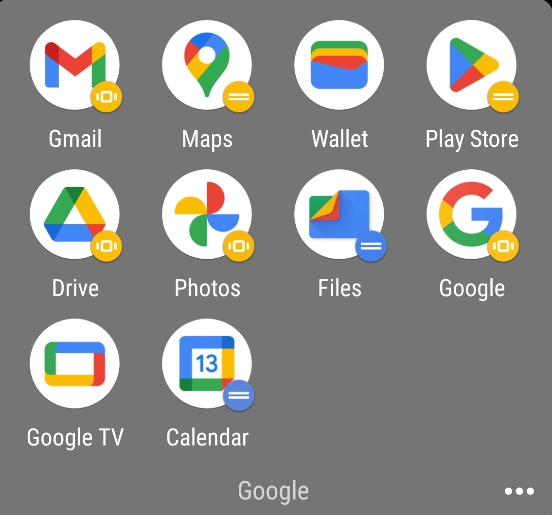
Not disagreeing with you there. I wasn’t even much of an icon pack guy until they did the white circle thing. It looks so cheap
And then they introduced to android a new option that only showed the shape of the icon in two tones. Now they have no colour and are just odd shapes.
Although the icons are kinda not minimal with the amount of colors in there, they could have like made one app with one or two colors and the other with different ones
Why does Drive not match the color tone of the rest of them? It’s so muted.
deleted by creator