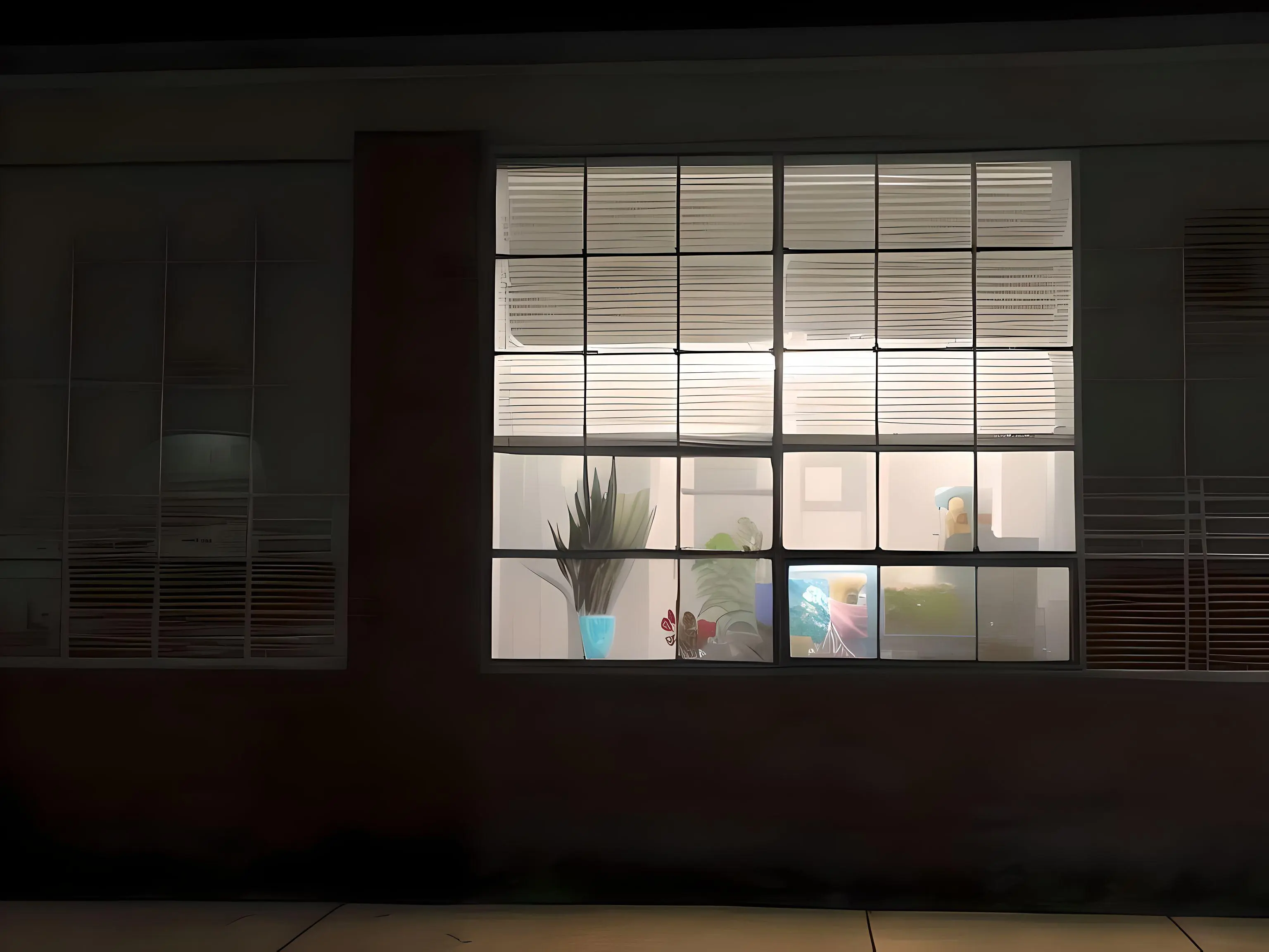
When u order prince’s kitchen on wish.com
What kind of psychopath puts marble floors in their kitchen? I feel like they could almost pull off the grape skittle colored cabinets if they just had laminate flooring and maybe a wooden countertop lol
The purple cabinets could have worked if they were mid-century-modern steel cabinets or something instead of basic-bitch builder-grade wooden ones.
A quick-and-dirty Gimp hue shift of a random kitchen pic I found online to illustrate:

It’s better. But I still hate it.
I gotta be honest: my version looked a lot better, even with the purple hue, before I turned up the saturation and turned down the value to match OP’s picture.
Maybe a different shade to clash less with the rest of the room but yeah I can see where you’re going here.
Maybe something more like an Ube shade
Like this, maybe?

(That’s the “changing hue but not saturation or value” version I alluded to in my other reply.)
I kinda dig it, I’d probably look at other colors for the walls still but I think that shade of purple could definitely do some work in the right surroundings
I 200% agree why is the colour so loud, please destroy that travesty
Looks like someone edited the colors to me
Well that may be, but I stand by my comment about the marble floors. That is the floor of a demented sociopath
It looks to be one large slab, so it’s not marble and mostly likely a photoshop job or vinyl sheet flooring which tends to be a bit squishy and slip resistant.
Somehow that seems even worse. Especially if he managed to spend $15k on it.
I’m told (by HGTV and the like) that $15k is on the cheaper end for a kitchen. Still, this guy overpaid by about $30k.
Photo looks washed out/filtered so some details look weird…I mean weird besides Grimmace’s moms kitchen weird.
Well the biggest hint to it being one piece is the pattern. That just doesn’t happen naturally in marble tile and you won’t find a manufacturer to bother making something like that with porcelain/ceramic.
OMG, that’s exactly what I was thinking! The curves and swoops of color are WAY too big to be even large format marble tiles. Plus the countertop has the same design. I think this has got to be some sort of diy paint job, but the photo quality is only just above potato so it’s hard to tell
Yeah, it looks photoshopped
it aint a flip, it’s a flop.
I hope this drives down the cost of the house so that poorer people can own houses and the market starts crashing
Why do you want poor folks to have to inhabit this lol… They have enough going on
deleted by creator
Omg it’s like my first house from the sims
This one isn’t bad, in an art deco kind of way. At least they fully committed to the aesthetic instead of having greige walls with neon cabinets.
I hate the swastika floor billard room.
Oh, you weren’t joking…
If you say so. Doens’t look at all like a swastika to me. Not even if I try.
Here’s fixed perspective of it:
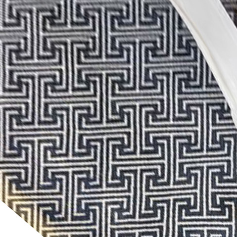
EDIT: Oh! I see it! To me the background is dark and the white lines are the objects in the foreground. I had to really look to find it. I guess some people see Nazis everywhere. I just see pretty lines. Besides, there are instances that spiral in both directions, so it’s fine. I highly doubt it’s deliberate, and you’re ignoring that the lines keep going to make larger spirals. If you think it’s secret Nazi signaling, I think you’re nuts.

Where did I say its secret nazi signaling?
Saying I‘m nuts for seeing swastikas in this pattern is like saying all the people that saw the dress as silber/blue are nuts. Some people have different pattern recognitions than others and for me the white was the background and the black was the foreground. I mean you even admitted that you see it after the second look.

Some people see a musician and some people see a woman at first. Do you think those that see the musician are nuts too?
Maybe its jusr because I‘m german and we are way more cautious about this topic than most other countries. Swastikas are a complete nogo for us and its even illegal to use them as a symbol outside of historical context.
But everyone sees two bears high fiving first
That’s fuckin wild, but still not as bad as prince’s wish.com kitchen.
At least the kitchen looks like a kitchen and not like you murdered a Troll Doll in it.
That bathroom… Ugh… You could never get me to live in this prison, I’d find dinner West tomorrow escape.
The Third Street Saints the moment they get a new property
A recirculating hood over a gas range. What a fucking genius.
I’ve unfortunately had to live this life in a couple of apartments 😑
I’ve had these in my last two rentals. People just don’t care.
It’s for when I burn the pancakes
Seems more like there‘s some absurd color flipping going on here with how purple that marble looks.
Reminds me of when I looked at an apartment (not even a house to buy–a rental apartment) and they had painted the kitchen all in red. I knew I just couldn’t live like that.
ATBGE
The worst part is I don’t even hate that marble, but this kitchen is so ugly.
Unique tastes require unique customers.
Basic works. https://www.youtube.com/watch?v=d1mbbYKPpHY
am I the only one here who actually likes this aren’t y’all overreacting
The problem with niche tastes is that they’re niche
They’re minerals Marie!
All that marble yet they left the tile backsplash?!


