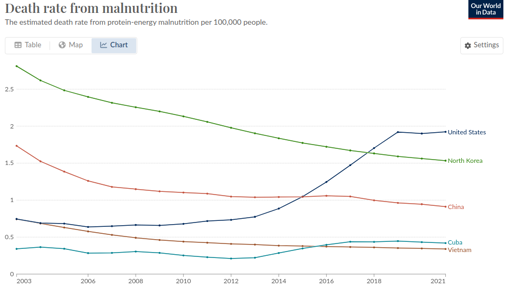
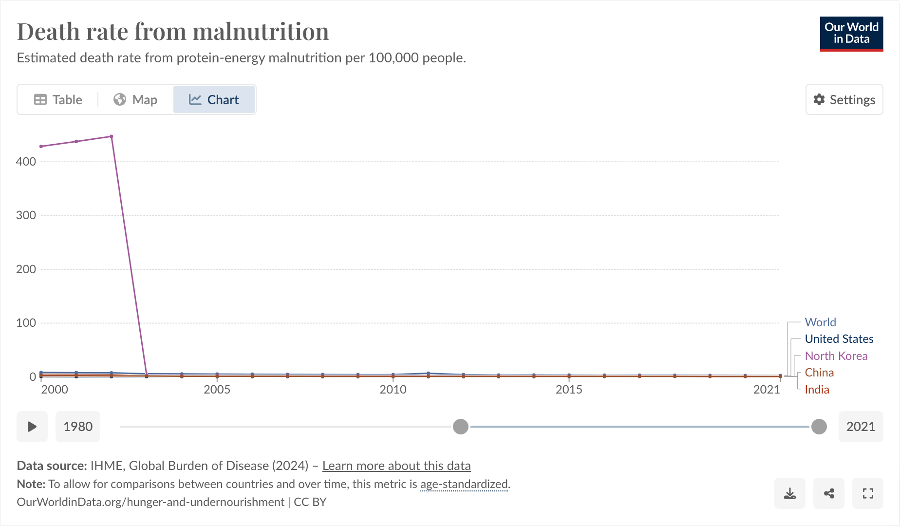
This is a weird one. Bear with me. From !dataisbeautiful@lemmygrad.ml:

So I said to myself, “that’s a little bit weird. The US one going up, I can actually believe, but the North Korea one being lower is definitely wrong.”
I think Our World In Data is just being shoddy, as they often do.
https://www.wfp.org/countries/democratic-peoples-republic-korea
The thing I found funny, and why I’m posting here, comes from observing why it was that they started their graph at 2003 and exactly at 2003.

I feel like you could use this as a slide in a little seminar in “how to curate your data until it matches your conclusion, instead of the other way around.”
And also, I don’t think the hunger rate suddenly dropped from epic to 0 exactly in 2003, I think more likely Our World in Data is just a little bit shoddy about their data.


Someone told me a few days ago that Israel was striking Syria with nuclear weaponry, and the only reason I didn’t know about it was that I only consumed Western news sources.
They sent me an article that proved it! And a video of the explosion. Okay. I stopped talking with them shortly after that, after they said “Thank you for taking the bait. We’ve now come full circle,” without explaining what they meant by that.