lnxtx (xe/xem/xyr)@feddit.nl to 196@lemmy.blahaj.zoneEnglish · 10 months agoVal(r)u(l)efeddit.nlimagemessage-square13linkfedilinkarrow-up12arrow-down10
arrow-up12arrow-down1imageVal(r)u(l)efeddit.nllnxtx (xe/xem/xyr)@feddit.nl to 196@lemmy.blahaj.zoneEnglish · 10 months agomessage-square13linkfedilink
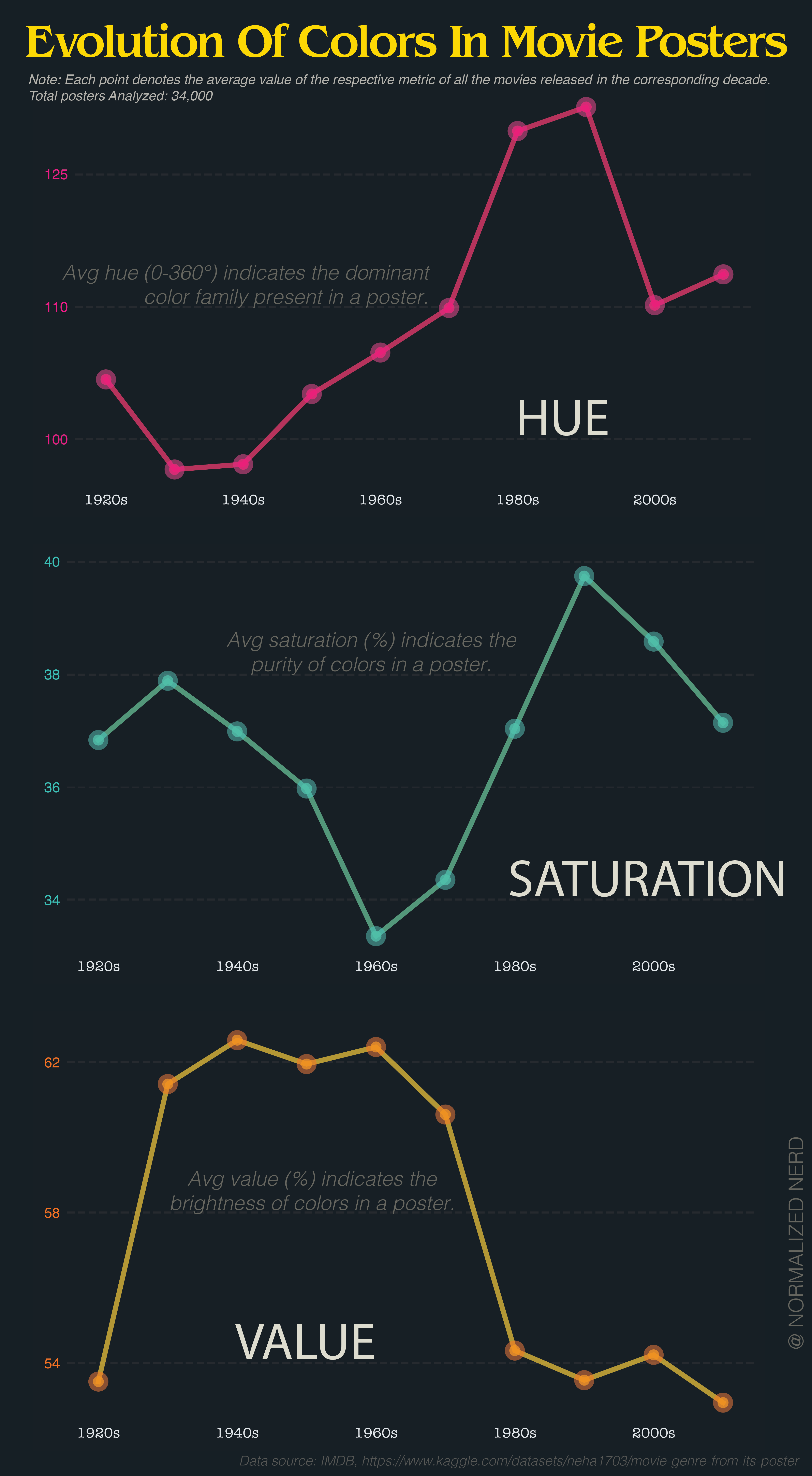
minus-squareZwiebel@feddit.orglinkfedilinkEnglisharrow-up2·10 months agoI’d be nice to have a color legend next to the y-axis of hue
minus-squarepetrol_sniff_king@lemmy.blahaj.zonelinkfedilinkarrow-up1·10 months agoThat’d be nice. 90 and 120 are rolling through the greens. Are posters mostly green? That seems odd to me.
minus-squarebob_lemon@feddit.orglinkfedilinkarrow-up2·10 months agoThe problem is that averaging hue makes no sense at all because hue is not a longest scale. If you take a red poster (0) and a blue poster (240), it averages to green. Or take red (0) and red (359), averaging to cyan (180).
minus-squareflying_sheep@lemmy.mllinkfedilinkarrow-up1·10 months agoThe average of 0° and 359° is obviously 359.5°. it’s a radial scale.
minus-squareflying_sheep@lemmy.mllinkfedilinkarrow-up1·10 months agoYou know what, I completely agree.
minus-squarebob_lemon@feddit.orglinkfedilinkarrow-up1·10 months agoBy that logic, the average of red and cyan is both purple and lime. Still useless.
minus-squareflying_sheep@lemmy.mllinkfedilinkarrow-up1·10 months agoNot if there is a clear trend. If most movie posters are blue, three average will be blue. But i agree, it is useless if there is no clear trend.
minus-squareSpaceNoodle@lemmy.worldlinkfedilinkarrow-up1·10 months agoOr even better, change the color of the points and lines to match the associated hue.
minus-squareshneancy@lemmy.worldlinkfedilinkarrow-up1·10 months agoyeah that part of the graph is completely useless to people who haven’t memorised the exact degrees of the scale, which is most people, even most artists


I’d be nice to have a color legend next to the y-axis of hue
That’d be nice.
90 and 120 are rolling through the greens. Are posters mostly green? That seems odd to me.
The problem is that averaging hue makes no sense at all because hue is not a longest scale.
If you take a red poster (0) and a blue poster (240), it averages to green. Or take red (0) and red (359), averaging to cyan (180).
deleted by creator
The average of 0° and 359° is obviously 359.5°.
it’s a radial scale.
deleted by creator
You know what, I completely agree.
By that logic, the average of red and cyan is both purple and lime. Still useless.
Not if there is a clear trend. If most movie posters are blue, three average will be blue.
But i agree, it is useless if there is no clear trend.
Or even better, change the color of the points and lines to match the associated hue.
yeah that part of the graph is completely useless to people who haven’t memorised the exact degrees of the scale, which is most people, even most artists